Colour grading for beginners
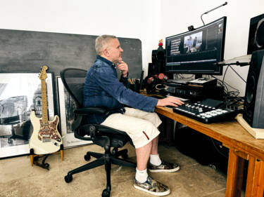
When creating great video, colour grading is the ‘secret sauce’. Dom Salmon demystifies what it is, how to get started, and why the new Nikon Z50II gives you the upper hand
In the world of moving images, colour grading is the fairy dust for footage, creating mood, drama and emotion in your videos. But what exactly is it? To the beginner, it can all seem a bit of a dark art but, with a solid grounding in some basics, you’ll quickly find you can add a new dimension to your movies and really make your audience sit up and pay attention.
What is colour grading, and why does it matter?
The first time I really became aware of the process of colour grading in movies was when I saw the ‘dailies’ (i.e. the non-graded footage from a day’s shoot, also known as ‘rushes’) from the film The Godfather and it all looked a bit… rubbish. Washed out and flat.
The final result on screen was obviously stunning, so what happened between the developed negative and the final print? The answer, of course, is colour grading – controlling contrast, varying exposure across the image in post-production and effectively adding an extra stage to enhance the ‘look’ of the final product.
The Godfather | Opening scene
The dark, brooding atmosphere of this iconic masterpiece is hugely influenced by the muted lighting and ochre tones of cinematographer Gordon Willis

Use 1: Rescue mission
Filming video outside of a controlled studio environment (which can be anything from a movie set to a fledgling YouTuber’s bedroom) is an imprecise science. It’s rare that any videographer, from beginner to seasoned professional, has full control of a location.
As a result, footage can be underexposed, look harsh and contrasty, have a weird colour to it, etc. With colour grading, however, we can tweak exposure, contrast, white balance… et voilà, that footage file you were going to drag into the trash is now half decent, or potentially great.
This is an example of grading as a straightforward tool. As a bonus, the more you try to salvage footage and identify problems, the more you’ll be able to avoid those mistakes in the future, making your edit a whole lot easier.
Typical techniques for this type of grading:
- Adjust exposure and contrast to bring out hidden details
- Correct White Balance for a more natural tone
- Reduce noise in dark areas.
A video colour-checker card (seen in the video above) is a great tool to find your footage’s baseline. Film a few seconds under your lighting set-up and see what’s ‘out’ in your frame. If a white square looks pale blue, for instance, your White Balance ‘temperature’ is too high a number.
Use 2: Eye-popping results
Next, we get footage that’s well exposed, but it lacks a little life, it’s not very dynamic, the foreground and background aren’t very different. It’s all a bit underwhelming. What can we do?
By focusing on things such as contrast, saturation and exposure, we can add separation between subject and background and generally give a little bit more of a 3D ‘pop’ and presence to your footage.
Capture tip: Don’t always try to fix it ‘in post’. For instance, a shallow depth of field is a more natural and easier way to separate your subject from the background. Remember, it’s always better to enhance an existing characteristic of your footage than to try and create it from scratch in your editor.
Typical techniques for this type of grading:
- Boost saturation to make colours richer
- Increase contrast between foreground/background for more visual separation of your subject
- Add selective colour grading (e.g. enhancing a blue sky or green foliage).

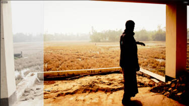
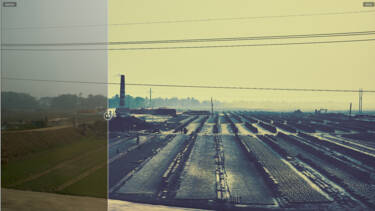
Before and after colour grading
Use 3: The storyteller’s tool
Grading is a key storytelling tool for movie makers. Whatever the size of the project, you can still use the biggest-budget blockbuster concepts in your own movies. Let’s turn to two very different examples of this idea from some recent movies.
First up, is the body horror mash-up smash, The Substance. Working with director Coralie Fargeat, DP Benjamin Kračun created an incredibly exaggerated colour palette and ‘hyper-real’ look for this movie. The colours are very primary, everything is very saturated, there’s a huge amount of contrast as a result of some very harsh lighting. Overall, everything seems overly ‘spikey’ and in your face. This, coupled with extreme wide lenses and close-ups, creates a very disorientating feel for the viewer and enhances the idea that our perceived reality is actually ‘fake’. It’s a very radical and conscious effort to affect the viewer.
The Substance | Pump it Up with Sue
Garish colours, harsh contrast, crazy angles – The Substance is a sensory overload for the viewer.

At the other end of the scale is the recent The Batman iteration of the DC superhero. In contrast to The Substance, director Matt Reeves and DP Greig Fraser dug deep into a very moody palette, full of almost monochromatic frames with heavy orange and ochre tones. Coupled with blurry and indistinct visuals, it’s a hugely evocative interpretation of an oppressive and shadowy Gotham.
The Batman | Iceberg Lounge Fight
The Batman’s dark, almost monochromatic look is a powerful way to submerge the viewer in this superhero universe.

Your footage can be made hugely more engaging and powerful by implementing these same ideas (e.g. a very bright, colourful palette for a dance video, a very understated sober look for a serious interview).
Typical techniques for this type of grading:
- Exaggerating use of exposure, dark or light, to create a mood
- Creating a colour palette and style to reflect the story
- Placing the viewer into a ‘reality’ for a more engaging experience.
How to start with grading
If learning to grade video footage seems daunting, here’s the good news…
You’re always researching
Every time you watch a movie or a TV show, you’re seeing how someone has used a visual look to reflect and enhance its themes and narrative. So, it’s a good time to go and rewatch a show or film that really moved you – and see how its visual style contributed to your experience.
You’re always doing it
Unless you are a ‘no-filter’ absolutist, you’re probably tweaking your phone footage before you upload it online. You should be very excited that you can do that with your Nikon mirrorless footage, but with a ton more power and control.
You can start right now
When you fire up a desktop non-linear editor (NLE) such as Apple’s Final Cut Pro for the first time, it can seem daunting, but do not fear. If you have a stills image editor such as Nikon’s NX Studio (and you should – it’s free!), the principles are much the same. Grading controls in apps for stills look very similar to their video counterparts, so if you’ve done any stills editing before, you know a lot more than you think.
Colour wheels
We’ll begin with the main tool for colour grading: colour wheels. I prefer Final Cut Pro’s colour wheels, but other software is just as good.
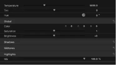
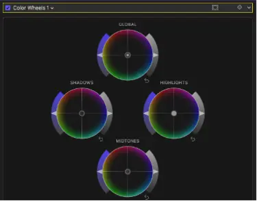
In the left-hand panel, you can see the four ‘wheels’ themselves. They are essentially the same, they just treat different parts of the image. GLOBAL, as the name suggests, affects your entire image (e.g. increasing the overall exposure), whereas SHADOWS, MIDTONES and HIGHLIGHTS only treat that spectrum of brightness (e.g. making the shadows darker or ‘blacker’).
Each wheel has three ‘parts’:
- To the left is a slider that boosts the saturation (making colours more vivid) of this part of the image.
- The central ‘pin’ in the circle with varying colours at its edge dictates the colour bias of this image area. Dragging the central pin towards the red edge of the GLOBAL circle, for example, will add a red hue across the whole image. Conversely if the overall image is a bit purple, dragging the same slider towards the green side (i.e. ‘away’ from the purple edge) will help to correct this.
- The last slider on the right is for the exposure/brightness of this part. For instance, skin tones often live in the MIDTONES band, so a little boost of brightness here might help faces stand out.
Please note: The names for these wheels may change depending on your app, e.g. Global is sometimes called Master, but the function is the same.
The right-hand panel shows those wheels in numeric form, but also includes colour temperature, tint and hue. At the bottom is a Mix control that allows you to determine the strength that this colour grading selection will have on your final image (zero is no effect, 100 is full strength).
Tool tip: I tend to ‘overcrank’ or exaggerate my colour wheels and then use the Mix to get a feel for the sweet spot. Also, I use the ‘X’ check box to turn the effect on and off as I go, so I can see how different my grade is to the original capture. Like the amplifiers in Spinal Tap, it’s very easy to turn everything way up to 11, creating a very over-hyped effect when you take a step back. This can look artificial and unnatural and it’s an easy trap to fall into.
If you can get a feel for how these work, you’ve cracked a huge chunk of what you need to know in colour grading, and they are surprisingly easy to get to grips with.
For instance:
- Footage a bit dark and washed out? Push the Master Saturation and Exposure sliders up a little. This should lift your footage’s brightness and colour.
- Feels a bit flat and lacking in ‘3D’? Take the exposure for Shadows down, while pushing Highlights exposure up. You’ll see an immediate change in contrast and dynamic range.
- Want to separate your subject more from your background? Reduce Shadows exposure (where your background probably lives) but also drag its colour pin towards the teal colour on your wheel’s rim (bottom right). Then brighten your midtones (where your subject lives) and push its pin towards the orange side (top left). Your subject should now have a very subtle shift away from the background detail. As a note, this is a classic orange/teal look that is very fashionable in TV and movies at the moment. Even if your background and subject are a little close, exposure wise, it should help. In future instalments, we’ll learn how to use masking to be even more laser-focused in your frame’s colour grading…
Get grading
So, no excuses. Import some footage, call this panel up, grab your sliders and see what happens. I’m a huge believer in trusting your eye, so keep looking at how each tweak affects your image and constantly A/B what you are doing to see the effect and judge if it’s better.
It will be a fiddle at first, but at some point it will ‘click’ and you’ll find you can achieve any look you want without even thinking about what you’re doing. If you think it looks right, it is right, so trust your instincts.
Most importantly, you’ll soon start to establish your own style. Are you a bright, primary-colour content creator, or a gritty grainy documentary type? Only you can decide. And remember that all major apps will allow to save any ‘look’ you create as a preset, so you’ll build up a visual library of your personal ‘vibes’ very quickly, cutting down repetitive work in your future footage. And just like with stills editing, you can download others’ presets (called LUTs) for instant looks. For more on LUTs (including free ones from Nikon/RED) take a look here.
I’ll leave you with some challenges to help you get an A grade for your videos. And in part 2 of our grading journey we’ll look at shooting RAW and Log footage for even more control and using LUTs as a springboard to expanding your creativity.
- Dig out some footage that you have buried on a hard drive because it’s a bit of a disaster and see if it can be saved. Look to see if boosting the exposure and colours globally can help. If not, how about looking at brightening the midtones to make the subject stand out?
- Go back to some footage you were pretty happy with and see if you can add some brightness, contrast, saturation for an extra lift (like extra powerful chillies – use it sparingly).
- Find or capture a clip with some narrative feel to it (e.g. a street scene, a landscape or an event) and see how you can create a strong visual look to engage your viewers. From a stark, almost monochrome look to a super-vibrant, uplifting vibe, there really is no limit to what you can do.
More in software and colour grading
More by Dom Salmon

Unlock greater creativity

